Mamva
BRANDING
The client
MAMVA is a popular health-food restaurant located in San Pedro Garza García, Mexico that serves fresh smoothies, juices, salads and paninis.
keywords
Restaurant /Health /Branding /Interior Design /Print Design /Packaging
the objective
Design a brand that communicates health, freshness and good taste in a warm and comfortable space.
the solution
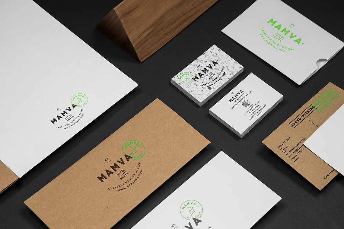
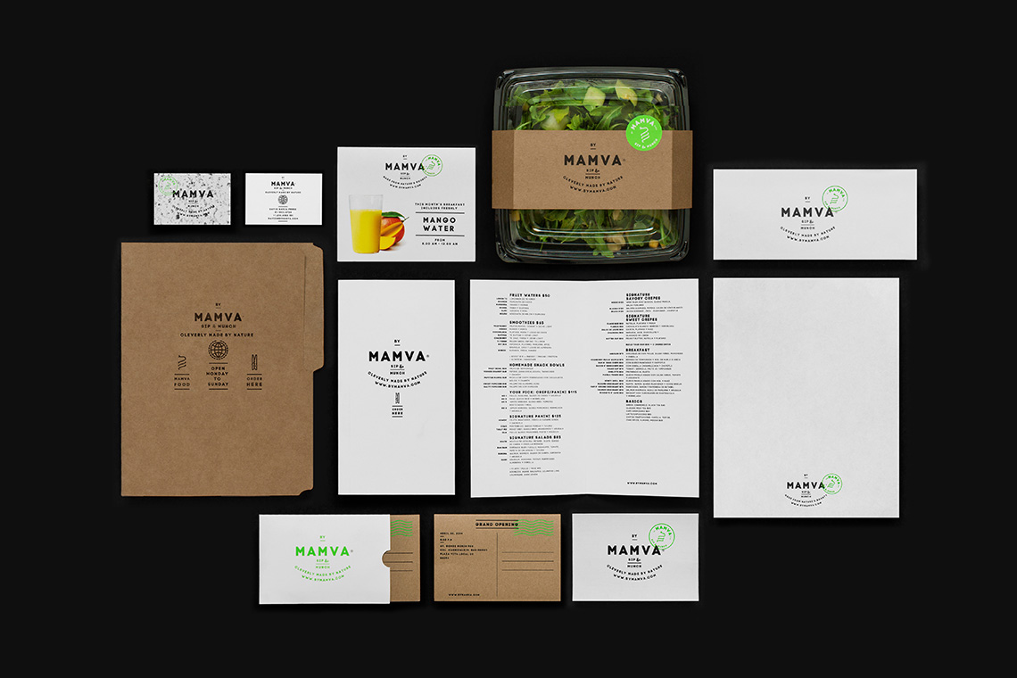
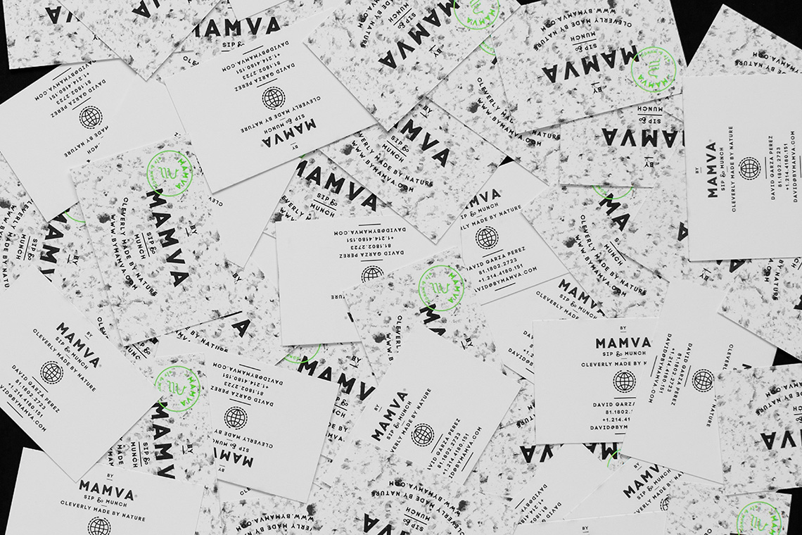
Our proposal uses symbolism and easy, simple language to communicate friendliness and natural health. Drawing from the idea that eating healthy is the best medicine, we featured the snake thanks to its status as a symbol of health and medicine since ancient times.
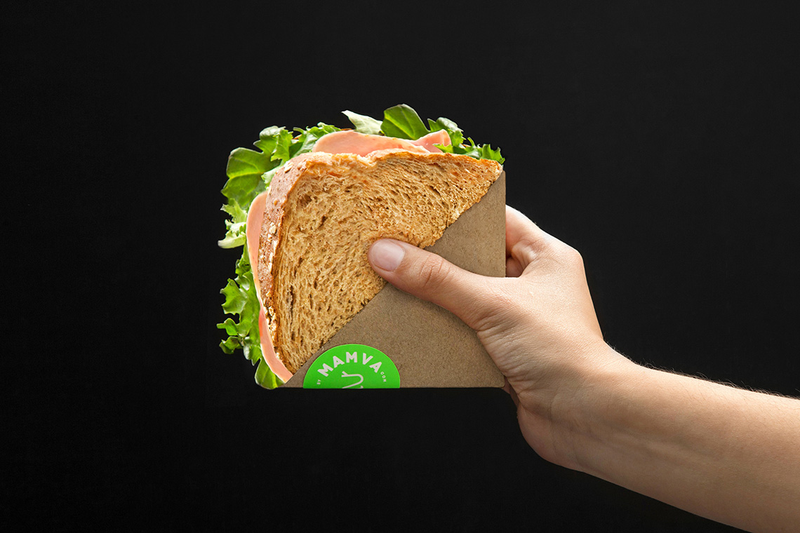
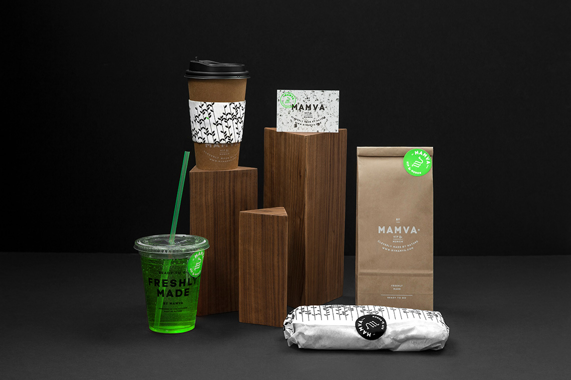
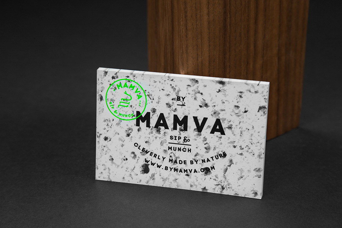
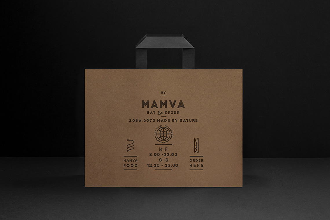
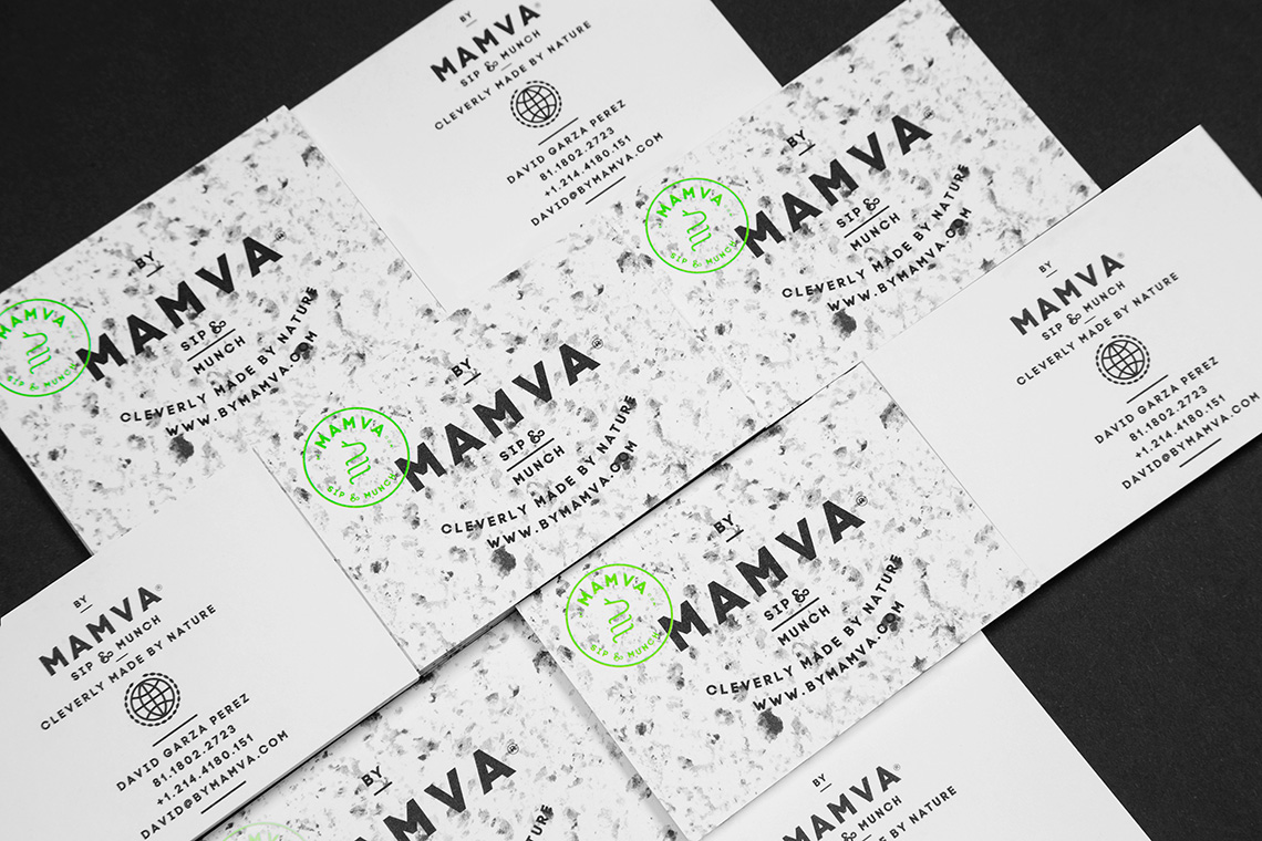
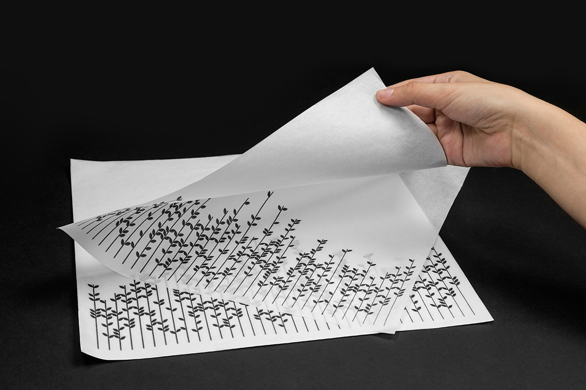
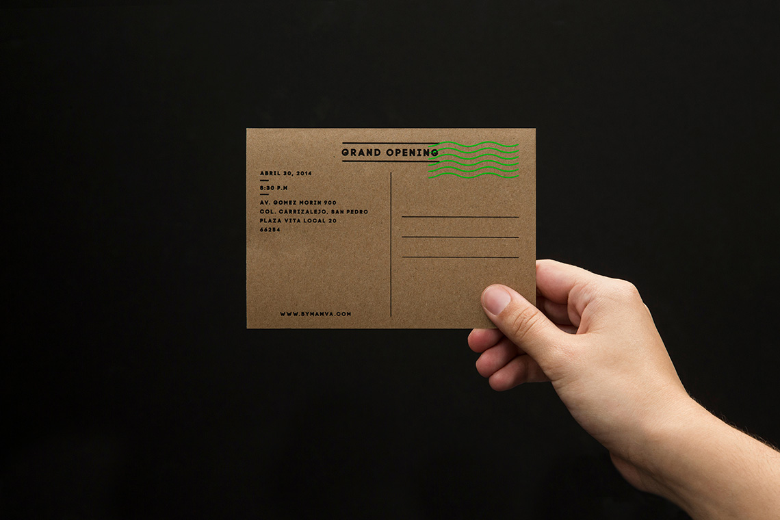
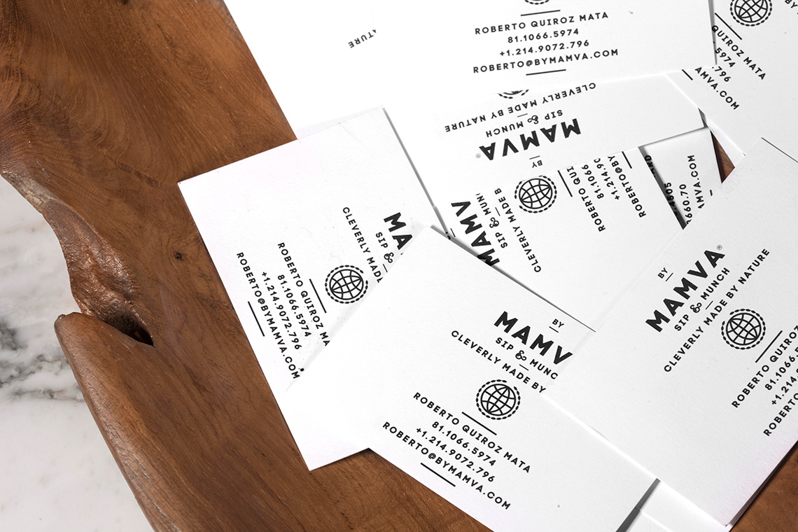
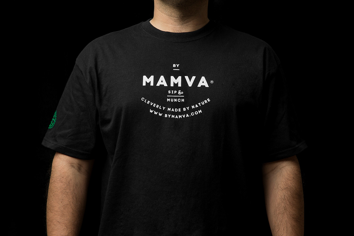
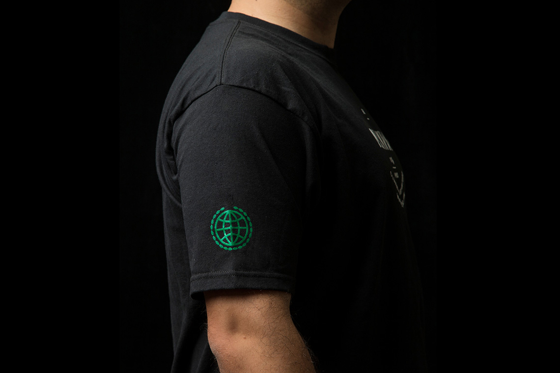
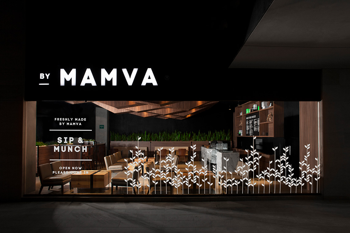
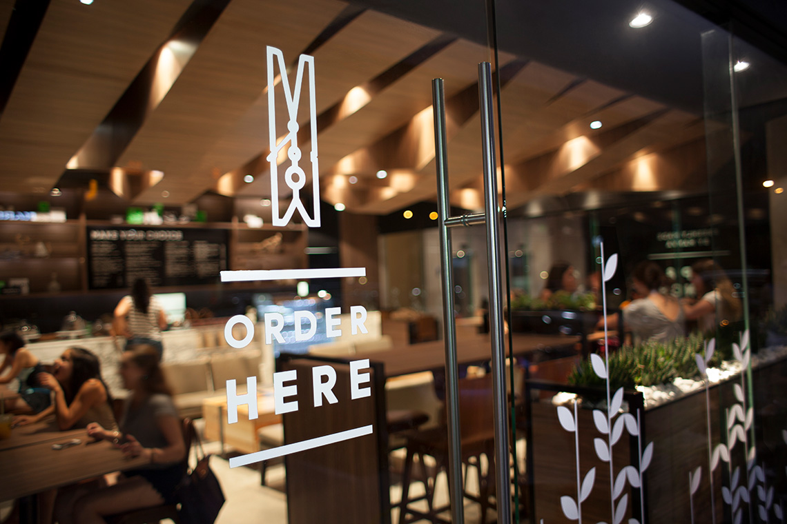
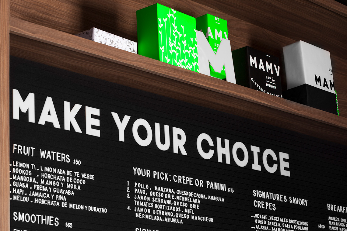
The color palette and rough materials give a care-free tropical vibe. The logotype presents a built-in, all-in-one practical guide to everything Mamva, such as its schedule and phone number. The brand also uses a simpler version of the logo in seal form, a nod towards its excellent food quality. Finally, reaching across the branding spectrum to the shop interiors, the plant stalks pattern tightly rounds up the entire brand.
— (A)
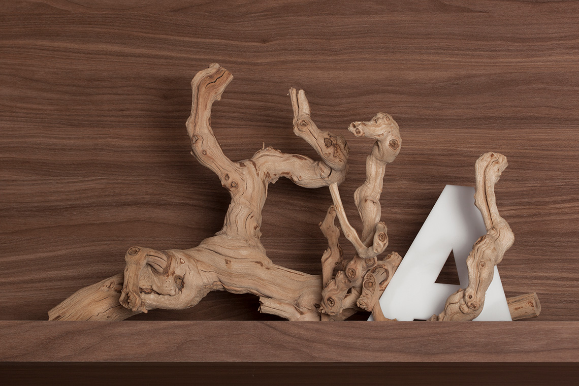
The color palette and rough materials give a care-free tropical vibe.
Mamva
ARCHITECTURE
the objective
Create a space that evokes nature, freshness and warmth.
the solution
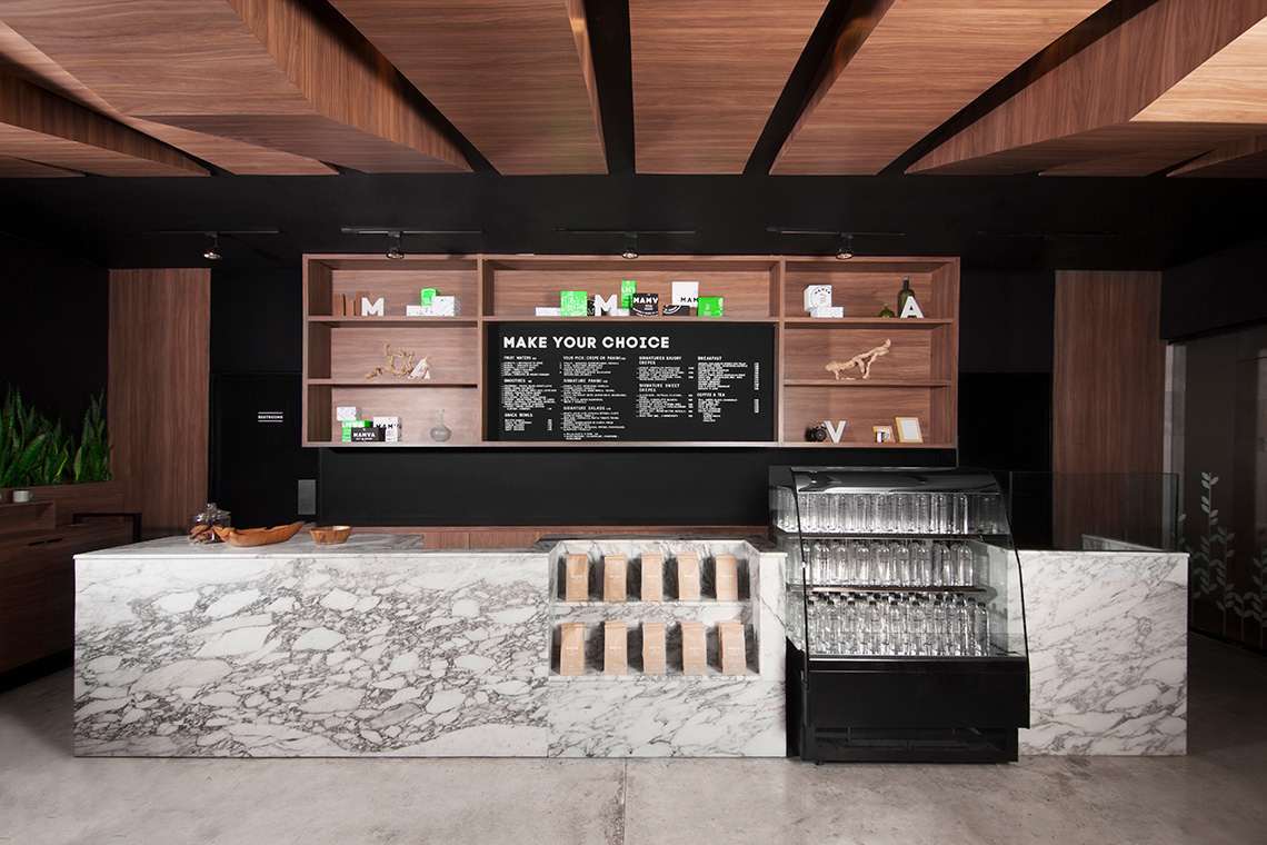
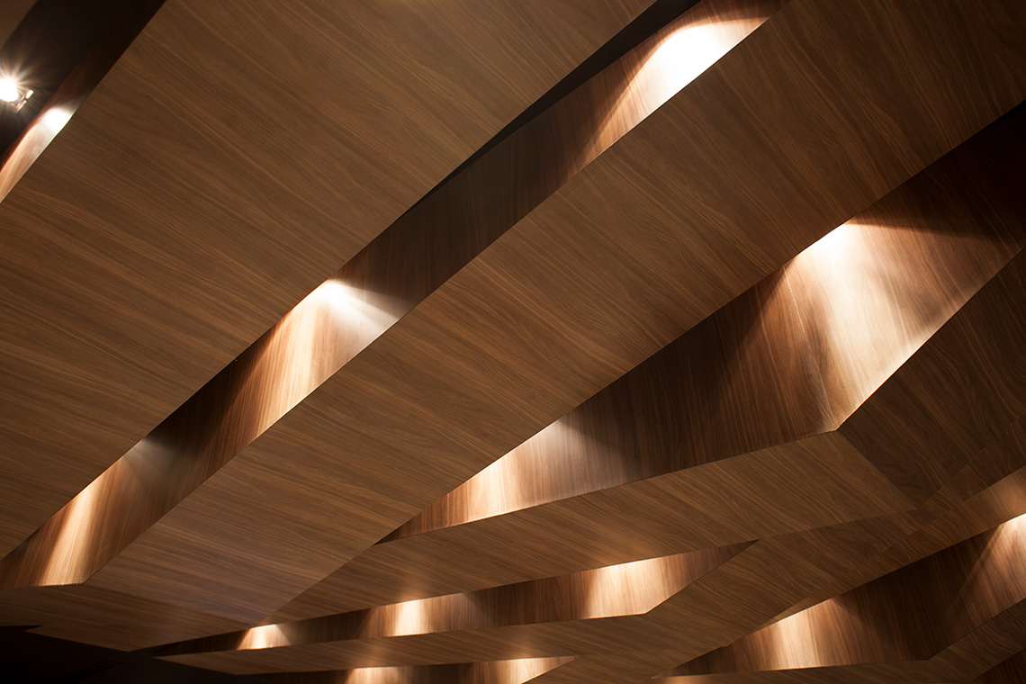
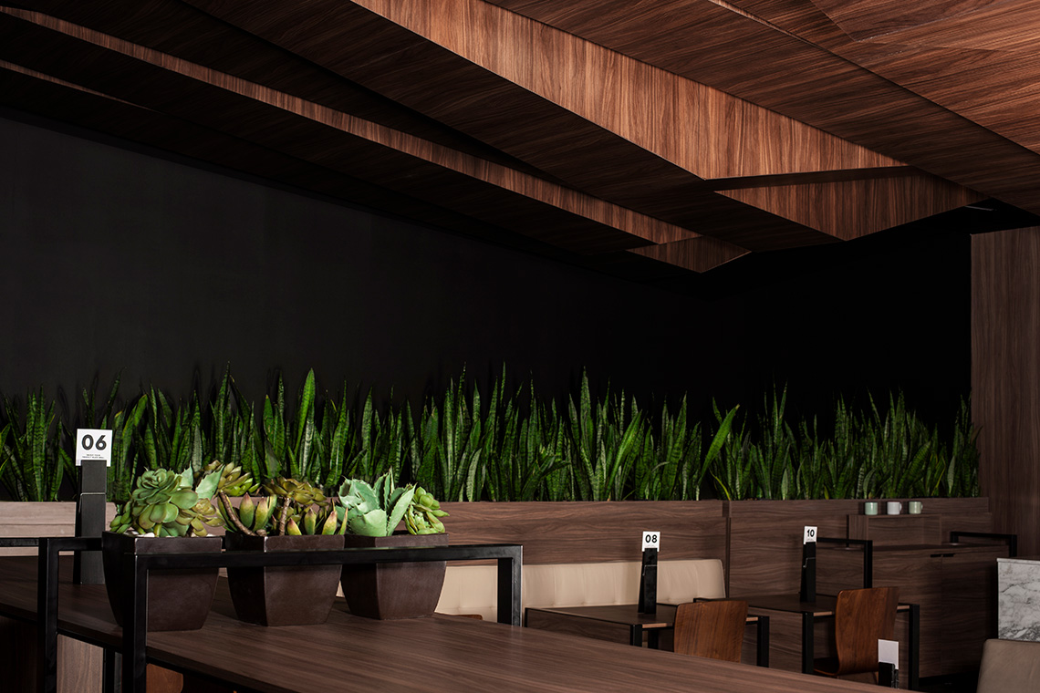
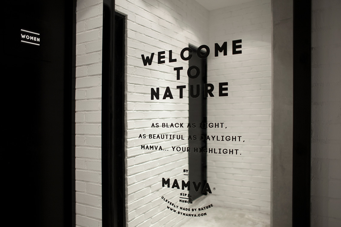
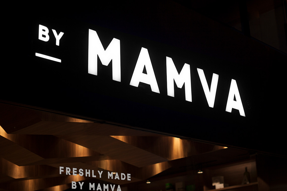
The interior design, with its enduring use of undisguised materials such as concrete, wood and marble, strives to be as honest as possible. The design embraces nature, so we included special space to plant vegetation. In addition, the ceiling has a unique and dynamic form inspired on the natural topography of mountainous ranges. The geometric ceiling amidst the steel furniture creates the perfect balance between modernity and warmth. — (A)
The design embraces nature.
